
Color Temperature and Illuminance: How to Pair CCT and Light Levels in Outdoor Lighting
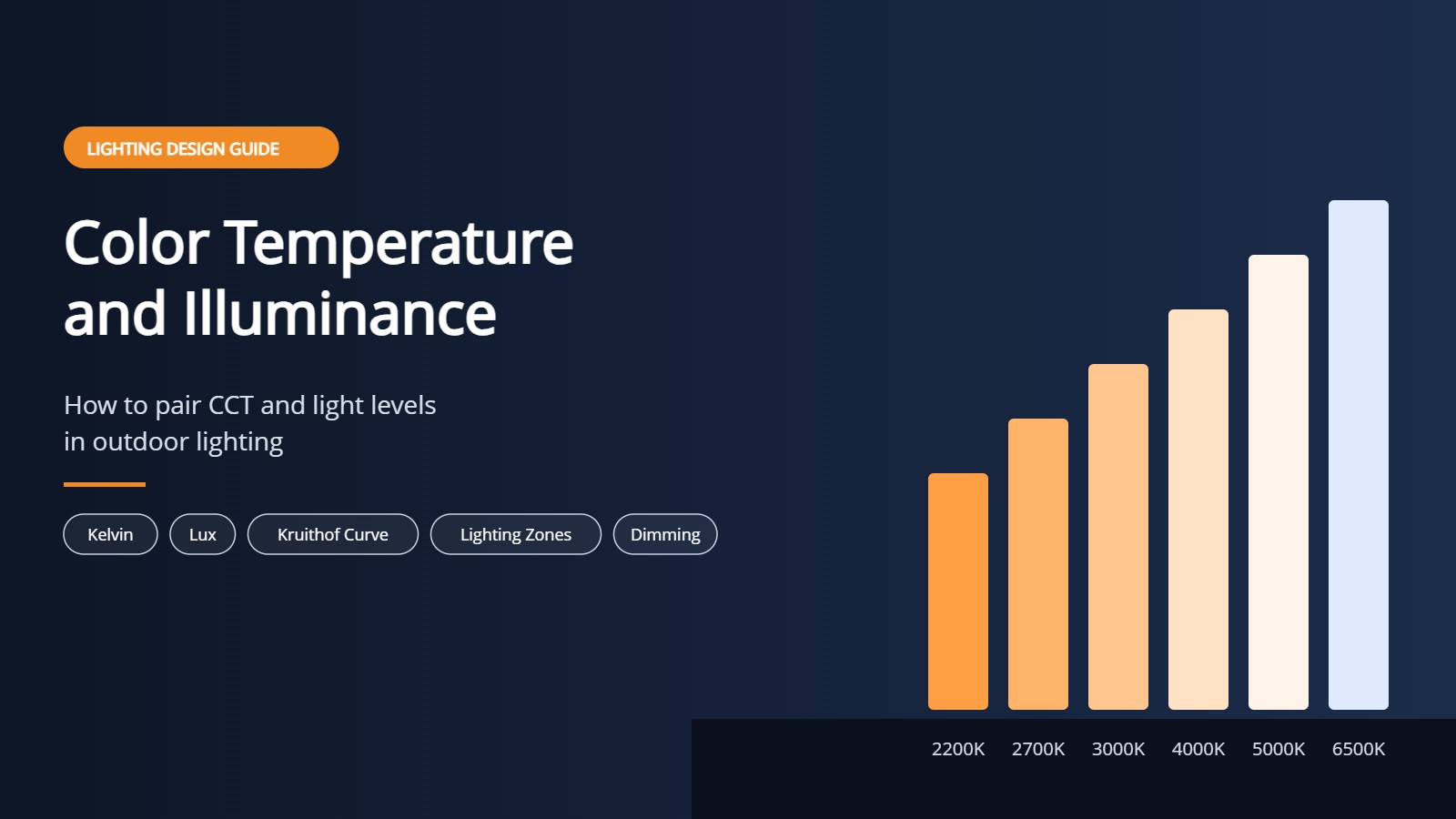
Every lighting specification carries two numbers that shape how a place feels at night: the colour temperature of the light, in kelvin, and the amount of light, usually given as illuminance in lux. They are often chosen separately, by different people, at different stages. Outdoors, they work together. Warm light at a high level can look heavy and orange. Cool light at a low level can look cold and gloomy.
This article is about getting the pair right on facades, plazas, parks and paths, and about a question clients ask more often than any other: how bright is too bright? For the basics of each term, see our guide to colour temperature and our explanation of brightness vs illuminance.
Three Numbers That Are Easy to Confuse
|
Parameter |
What it describes |
Unit |
|---|---|---|
|
Correlated colour temperature (CCT) |
The colour appearance of white light, from warm to cool |
K (kelvin) |
|
Illuminance |
The luminous flux falling on a surface, per unit area |
lx (lux) |
|
Luminance |
How bright a surface appears from a given direction |
cd/m² |
CCT and illuminance are what you specify. Luminance is what people actually see. It depends on the illuminance and on how much light the surface reflects. For a matte surface, a good approximation is: luminance ≈ reflectance × illuminance ÷ π.
That is why the same lux level can look completely different on two buildings. Light a pale limestone wall with a reflectance of roughly 0.6 to 50 lux and it reaches about 9.5 cd/m². Light a dark granite wall with a reflectance of roughly 0.1 to the same 50 lux and it reaches only about 1.6 cd/m². To make the granite look as bright as the limestone, you would need around six times the light.
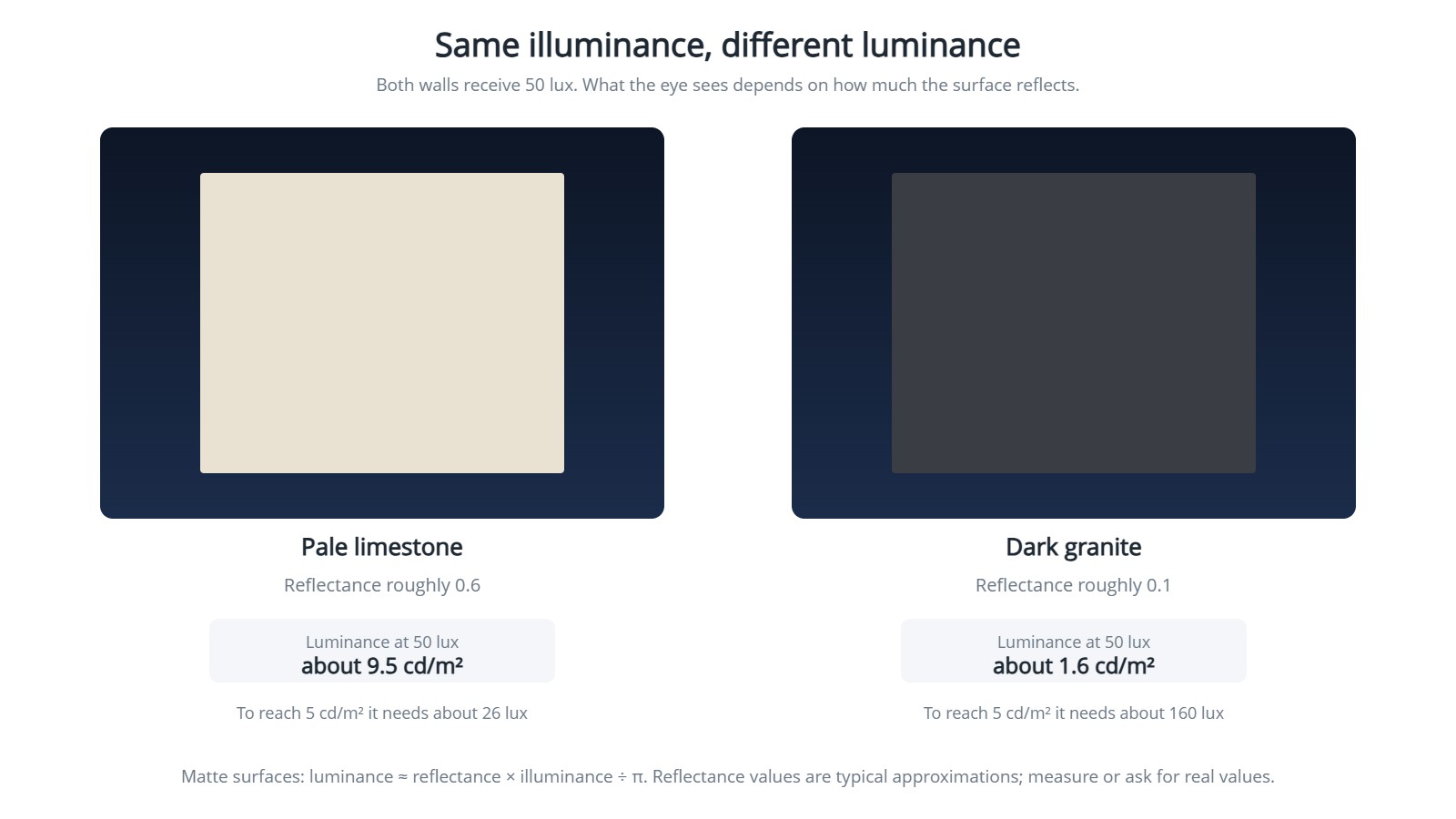
The reflectance figures here are typical approximations. Real stone varies with finish, weathering and moisture, so measure a sample or ask the supplier for values when the result matters. Glossy and polished surfaces do not follow the simple formula at all: they reflect light mainly in one direction, and can look dark from most viewpoints.
The Kruithof Curve: What the Research Actually Shows
In 1941 Arie Kruithof, working at Philips in the Netherlands, published a chart in the Philips Technical Review suggesting which combinations of light level and colour temperature people find pleasing. In short: low light levels look best with warm light, and high light levels with cooler light. Outside that zone, scenes look either cold and dim or unnaturally colourful. The chart is still quoted in catalogues and training courses.
The evidence behind it is thin. Kruithof did not report how many observers he used or how the judgements were made. Later experiments, including those by Davis and Ginthner and by Boyce and Cuttle, both published in 1990, did not reproduce his boundaries. In 2017 Steve Fotios published a review of 29 studies that had tested a Kruithof-type relationship. He judged nine of them credible: five did not support Kruithof, one gave partial support and three were unclear. In those studies, colour temperature had little effect on how pleasant a space was judged, while very low illuminance was more likely to be judged unpleasant.
That does not mean the curve has been simply "disproved". The studies differ in their settings, adaptation times, rating methods and observers, and colour temperature alone does not describe the spectrum of a light source. Almost all of them were also indoor experiments at light levels far above those of a night-time exterior. The fairest summary is that there is no reliable evidence for Kruithof's exact boundaries, and that the research does not tell an outdoor designer which CCT to choose. Outdoors, the choice is better made on the material, the surroundings and the rules that apply, which is where the next section starts.
Choosing Colour Temperature Outdoors
Four things usually decide the CCT on an exterior project:
1. The material. Warm materials such as brick, sandstone and timber look richer under warm light. Under cool light, red brick can look grey and dull. Glass, steel and white concrete can take neutral white.
2. The surroundings. Match the colour of nearby street lighting for a calm result, or contrast with it on purpose. An accidental mix looks like a mistake.
3. The use of the building. Hotels and residential buildings usually want warmth. Offices and civic buildings can be warm or neutral, depending on their identity.
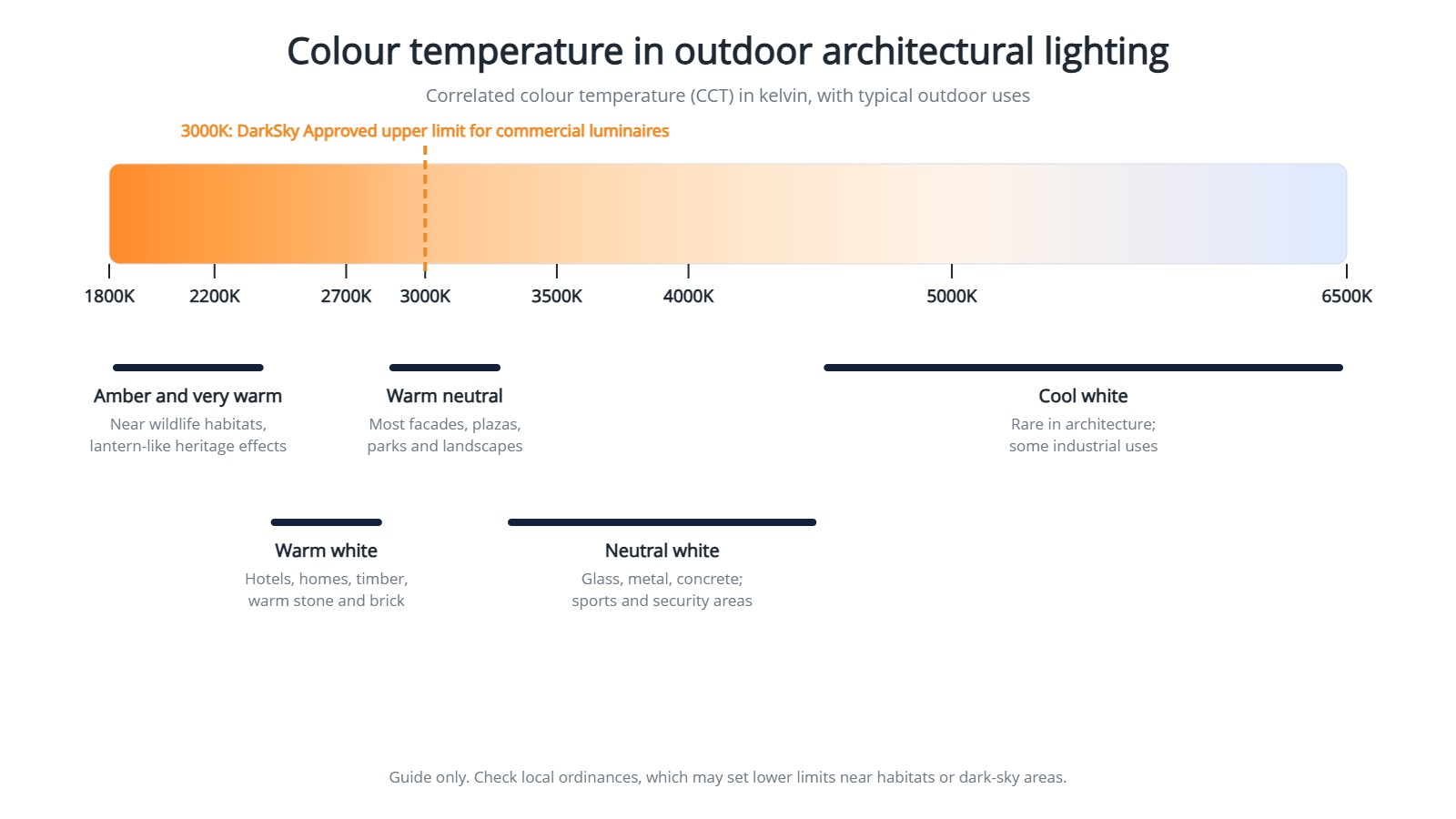
4. Rules and neighbours. For luminaires seeking DarkSky Approved status under its residential and commercial categories, the nominal CCT must not exceed 3000K. This is a program requirement, not a universal legal limit. Local lighting ordinances may set their own requirements, and some set lower limits near habitats and dark-sky areas.
As a practical rule, 2700K to 3000K suits most facades, landscapes and public spaces at night. 4000K is worth considering for modern buildings in glass, metal or white concrete, for a crisp, contemporary look, or where it matches the street lighting around the building, provided no local rule or program requirement limits it.
Practical Illuminance Considerations for Different Outdoor Settings
Different settings call for different measurements. Before arguing about numbers, agree which quantity matters and where it is measured:
|
Setting |
Metrics to focus on |
Design focus |
|---|---|---|
|
Building facade |
Vertical illuminance and luminance |
Brightness hierarchy, uniformity and glare |
|
Hotel entrance |
Horizontal and vertical illuminance |
A clear, welcoming entrance and visual comfort |
|
Park path |
Horizontal illuminance |
Safe walking, while keeping dark areas dark |
|
Commercial plaza |
Horizontal and vertical illuminance |
Activities and events, and visual comfort |
|
Landscape |
Surface illuminance and luminance |
Layers of planting, stone and features |
These are the indicators to look at during design. They are not legal illuminance requirements for each setting. Where functional lighting is involved, the numbers come from the standard that applies to the project: IES recommended practices in North America, EN 13201 for roads and EN 12464-2 for outdoor work areas in Europe, or the local equivalent. Any lux value quoted for a project only means something together with the standard it comes from, where it is measured (on the ground, on the facade, or at eye height), the maintenance factor used and the conditions of the site.
Light levels outdoors are also relative. A facade in a dark park needs much less light to stand out than one on a bright commercial street. Decorative lighting should be balanced against the functional lighting and the brightness around it, not simply added on top.
How to Tell Whether a Facade Is Too Bright
Guidance on obtrusive light divides places into environmental zones, from dark rural areas to bright city centres. CIE 150:2017 uses zones that range from dark, sparsely inhabited areas up to E4, for areas with high district brightness. In the United States, the Model Lighting Ordinance uses similar lighting zones LZ0 to LZ4.
For facades, some of this guidance sets limits on building luminance. The UK Institution of Lighting Professionals' Guidance Notes for the Reduction of Obtrusive Light GN01:2011 give these maximum average values before curfew:
|
Environmental zone |
Typical setting |
Maximum average building luminance, pre-curfew |
|---|---|---|
|
E0 / E1 |
Protected dark areas, intrinsically dark rural areas |
0 cd/m² |
|
E2 |
Low district brightness, such as villages and dark suburbs |
5 cd/m² |
|
E3 |
Medium district brightness, such as small towns and suburbs |
10 cd/m² |
|
E4 |
High district brightness, such as town and city centres |
25 cd/m² |
These figures come from a UK guidance note and apply to buildings lit deliberately as a night-time feature. They are average values over the lit facade, they apply before curfew, and they do not cover buildings lit only by spill light from nearby fixtures. The ILP published an updated edition in 2021, and other countries use their own guidance, so check the current document that applies to your project.
Combined with the luminance formula above, they give a useful sense check. On the pale limestone wall, about 26 lux gives 5 cd/m². The dark granite wall needs about 160 lux for the same luminance. If a calculation shows a stone facade in a village at 100 lux, it is very likely over-lit, whatever the colour temperature.
Numbers aside, three quick checks help on site. Is the building brighter than the most important thing next to it, such as a church or a landmark that should lead? Can you see the fixtures themselves from normal viewpoints? And does the lighting still look right after the shops around it close?
Putting the Two Together: Practical Pairings
|
Setting |
Colour temperature |
Light level approach |
|---|---|---|
|
Historic stone facade in a city centre |
2700–3000K |
Moderate. Show texture by grazing rather than competing with signage. |
|
Hotel or resort |
2700–3000K |
Welcoming at the entrance, softer elsewhere, dimmed late at night. |
|
Modern office in glass and metal |
3000–4000K |
Restrained. Cool light at high levels quickly looks clinical. |
|
Park or landscape |
2700–3000K, or amber near habitats |
Low, well shielded, with dark areas left dark. |
|
Event plaza |
Tunable white or RGBW, with a warm white default |
Higher during events, back to a calm default scene afterwards. |
Whatever you choose, keep it consistent. Fixtures at 3000K and 4000K side by side look mismatched, and even fixtures with the same nominal CCT can differ visibly between production batches. Our guide to matching colour on replacement fixtures explains how to avoid it.
Dimming and Time-of-Night Scenes
Light levels do not have to stay fixed all night. Many ordinances based on the Model Lighting Ordinance include a curfew, after which decorative lighting is reduced or switched off, and obtrusive light guidance usually sets stricter limits after curfew. A simple approach is a full scene in the evening, a reduced scene after the curfew and off in the small hours.
Plan this before choosing products, because it decides the driver and the control system. Our comparison of DMX vs DALI vs 0–10V covers the options.
Common Mistakes
• Choosing CCT from a catalogue photo. Screens and prints do not show light colour accurately. Look at a sample on the real material.
• Specifying lux without the surface. The same lux looks bright on white render and dull on dark stone.
• Over-lighting to make a building stand out. In dark surroundings a small amount of light is enough. More light adds glare, not impact.
• Cool white on warm materials. Brick and sandstone lose their colour.
• Mixing CCTs by accident, from different suppliers or batches.
• Ignoring the view from neighbours. Check glare and spill light from windows, not just from the street.
FAQ
What colour temperature is best for outdoor architectural lighting?
For most facades, landscapes and public spaces, 2700K to 3000K. Neutral white around 4000K suits some modern buildings in glass and metal. Check local rules, as some places limit colour temperature to 3000K or lower.
Does a higher colour temperature make the light brighter?
No. CCT describes the colour of the light, illuminance the amount of light falling on a surface, and luminance how bright that surface looks. Changing from 3000K to 4000K does not change the measured illuminance. Cool light can look crisper, but the brightness people see depends mainly on the illuminance and the surface it lands on.
What is the Kruithof curve?
A 1941 chart suggesting which combinations of light level and colour temperature look pleasing. Later studies did not reproduce its boundaries, and a 2017 review found that colour temperature had little effect on pleasantness in the credible studies. Use it, at most, as a historical rule of thumb.
How many lux does a building facade need?
There is no single figure. It depends on the surroundings, the surface reflectance and the effect you want. Start from the environmental zone and any luminance limits that apply, work out the luminance you want, convert it to illuminance for your material, and confirm with a lighting calculation using the fixture's IES file.
How do I know if my facade is too bright?
Compare its luminance with the limits in the obtrusive light guidance that applies to your area, and with the brightness of its surroundings. If it outshines the buildings and landmarks around it, or the fixtures themselves are visible and glaring, it is probably over-lit.
See the Light Before You Decide
The surest way to choose a colour temperature and light level is to see them on your own material. LNJAMI can send samples so you can compare colour temperatures on your facade, and provide IES files for your calculations. Request a free project consultation.
References
• A. A. Kruithof, "Tubular luminescence lamps for general illumination", Philips Technical Review, 6(3), 1941, pp. 65–73
• S. Fotios: A Revised Kruithof Graph Based on Empirical Data, LEUKOS, 13(1), 2017, pp. 3–17
• Institution of Lighting Professionals: Guidance Notes for the Reduction of Obtrusive Light GN01:2011 (copy hosted by Folkestone and Hythe District Council)
• DarkSky International: DarkSky Approved Luminaires guidelines
• DarkSky International: Lighting zones


